Last week BP3 announced the latest addition to their Brazos line of UI tooling for IBM BPM: Brazos Portal. Scott Francis gave me a briefing a few days before the announcement, and he had Ivan Kornienko, their director of UI/UX, along to give a demo.
As a recap, BP3 is a boutique-sized IBM BPM services and ISV partner, made of up a large contingent of ex-Lombardians (Lombardiites?) who know the IBM BPM product as well or better than any other partner out there. In addition to implementation services, they offer a free UI toolkit that allows you to easily build responsible HTML interfaces for IBM BPM applications that can support both mobile and desktop browsers. They sell the services and support around the Brazos UI Toolkit, but give it away to encourage adoption. This seems to be working: as of the end of May, they had more than 400 registered developers who had downloaded the toolkit and about 40 production deployments.
However, like that tendency to start redecorating your whole house once those new curtains make you realize how outdated everything else is, customers using applications built with the Brazos UI Toolkit wanted a more responsive and modern portal interface than the out-of-the-box IBM portal. After all, the portal is where many BPM users start and organize their day, only launching the applications once they’ve identified a specific item that they want to work on. According to BP3, the IBM BPM portal, in addition to not being optimized for modern browsers or mobile devices, has some performance issues due to server-side searching, sorting and filtering; it’s also difficult to customize and can be brittle once customized.
BP3’s answer to this is the Brazos Portal: responsive and mobile-ready, customizable, and with local search, sort, filter and task display for optimal performance. Although Brazos Portal is being positioned as a mobile portal – I suspect that BP3 doesn’t want to explicitly position against IBM’s own desktop portal – it appeared to be completely usable as a desktop portal as well, with the added benefit of a unified experience across all platforms. However, the two portals can coexist peacefully on the same process data, allowing for only certain users or devices to be on Brazos while the others are on IBM.
I’m getting to the part about the ring, really.
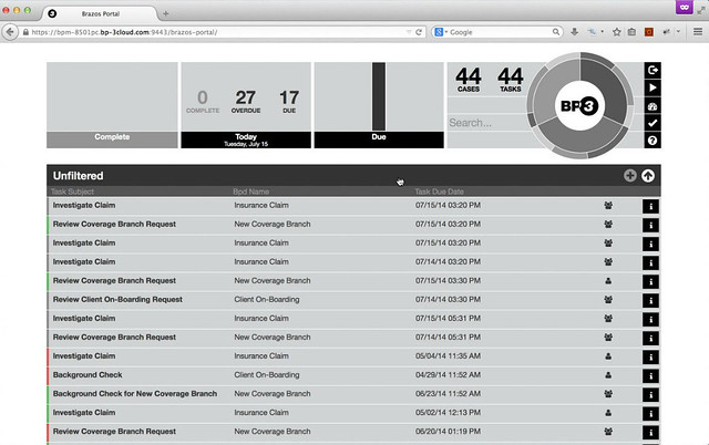
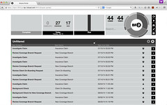 We started the demo with a sleek-looking but fairly standard view of an unfiltered user task list, showing a few metadata columns (task name, class, due date), with displays at the top showing aggregate information for work in progress, complete and due/overdue tasks. Clicking on an item in the task list opens the task application screen for processing the task (a Coach, in the IBM BPM terminology); in the demo, this opened an application written using the Brazos UI Toolkit although I’m not sure that’s a requirement [Scott, feel free to chime in here]. Clicking on a column in the task list sorts by that column, as expected; this is fast since it is done locally rather than requiring a re-query of the BPM server as (I think) the IBM portal does. It’s all in monochromatic greys and black, except for thin bars of color on the left of each item in the task list.
It’s also responsive: we were viewing it in a desktop browser, and when the browser was resized to the size of a tablet or mobile phone, the portal responded appropriately.
Then there’s the ring.
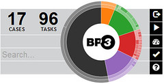 At the top right of the portal is a circular graphical element, with the BP3 logo in the center, that I initially just gloss over as window dressing. However, in the same block, there are some small controls to the right of it, a count of the cases and tasks in the current list, and a search field. This ring interface, or “Task Drive”, is actually a metadata filter control, positioned at the top right so that it’s right under where your right thumb would be on a touch-enabled screen, and the search field combines with the filtering selected on the ring. The appearance of the Task Drive changes as you interact with the portal to show you information about what is currently displayed, and how it breaks down by metadata. In our unfiltered list, for example, we had 44 cases and tasks, but hovering over one of the sectors in the ring showed us the corresponding metadata field that would be filtered and the resulting number of cases and tasks. Selecting a segment of the ring filtered the list to just those in the class “Client On-Boarding”, which had 14 cases and tasks. There are actually concentric rings in the Task Drive control, giving us a visual indicator of the potential filters; we had initially filtered based on the work class, and could then filter further by task name. We could also filter via a free-form search on any task metadata by entering text in the search field beside the ring.
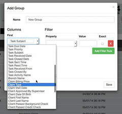 Things start to get colorful with groups, which are pre-defined filters: you define a view of up to three columns with filter criteria, using any metadata including custom fields defined on a work class as well as standard fields like due date and priority. This creates a new group in the task list, which is assigned a unique color, showing those tasks that meet the filtering criteria. Those that don’t meet the filter criteria are still in the black and grey “Unfiltered” list. Presumably, items can appear in more than one group if they meet the criteria, so the counts of the items in each group may be more than the overall count; only those that do not meet any of the groups’ criteria remain in the Unfiltered list.
Once you define groups, the Task Drive becomes equally colorful: the ring is now in sectors by color, with concentric rings indicating the metadata filtering/drilldowns for each group. We looked at an example that had four groups defined: High Priority Claims, Client On-Boarding, Other Claims, and New Coverage Branch, appearing as orange, red, green and purple (actually more like lavender). Each group’s list could be collapsed into a single title bar showing only the group name and item count, or expanded to show all items within it. Hovering over the green ring segment showed us that that corresponded to Other Claims, and had 6 cases and tasks. Clicking on the purple segment drilled into the New Coverage Branch group directly, then hovering over segments of the now-purple ring showed us the breakdown of items by task name.
The graph displays in the upper left of the portal actually contain live controls as well: the center one is a date control that cycles between today, days, weeks and months for filtering the other content in this navigation header including the Task Drive. Checking the “show complete” control to the right of the Task Drive also makes the Complete graph at the top left interactive.
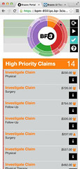 After the briefing with a live demo, I played around with the online demo version; one interesting feature (bug?) is that on my touch-screen Lenovo Yoga Windows 8 laptop, I could only get the ring to respond to the touch screen, not to the mouse control, although everything else worked fine with either.
The ring – sorry, Task Drive – is an extremely clever and beautiful piece of UI. However, I’m concerned about its usability by more traditional users, since it may not be as intuitive as the designers hope. Having the ability to pre-define groups for users (which is planned for the paid versions) will help sort out some of the confusion for users, but many may ignore the ring as if it were a graphical element, and just scroll through the lists in the groups rather than using the metadata filtering. BP3 reported that they had had very good reception of this as a filtering control, but their test group is likely skewed towards mobile users and the inherent selection bias; if they expect this to be used on the desktop as well, or by more traditional remote workers whose paper clipboard is replaced with a tablet, then they need to understand the learning curve behind that control.
Brazos Portal supports IBM BPM 8.0.1 and forward. It does not yet expose the new case management features in the 8.5 release, but that will probably show up in a future release. They have a fairly ambitious list of potential future features, and will likely develop these according to demand, so if you try out Brazos Portal and find something missing, be sure to give your feedback to BP3.
Brazos Portal is available in both free and paid versions, with the free version having launched last week. The free version has no active support, but BP3 will likely help out if they can in order to spur adoption, and would probably be happy to sell you some services to get you up and running. The premium version will include standard support and SLAs, plus features for pre-defined/shared user groups, custom branding and API incorporation; the enterprise version will include a support agreement customized to the organization, plus custom integration and cross-platform federation to allow multiple BPM servers to be integrated into a single portal.

Hi Sandy,
Thanks for the nice review of the Brazos Portal! I wanted to comment on the problem you saw with the touch screen:
> …one interesting feature (bug?) is that on my touch-screen Lenovo Yoga
> Windows 8 laptop, I could only get the ring to respond to the touch screen,
> not to the mouse control, although everything else worked fine with either.
This is a known issue in Chrome. IE and Firefox are both working correctly with the mouse control, but we are still working to figure out how to get Chrome to understand Windows 8 touch screens are not touch-only. Let us know if you see issues on the other browsers – we are mainly an Apple shop, so we only have limited touch screen Windows 8 machines to test with.
DAVID BAILIE
ENGINEERING MANAGER, BP3 LABS
[email protected]
BP3 /// http://www.bp-3.com / Blogs / Twitter / LinkedIn / Google+