DemoCamp Toronto 30 Demos

On October 12th, I attended the 30th edition of Toronto DemoCamp, and saw four demos from local startups.

Upverter is an online electronic design tools, using HTML5, Javascript and Google libraries to provide a drawing canvas for electrical engineers. With about 40,000 lines of code, it provides pretty complex functionality, and they are hoping to displace $100K enterprise tools. They are seeing some enterprise adoption, but are pushing in the university and college space to provide free tools for EE students doing circuit design, who presumably will then take that knowledge into their future places of employment. They have realtime design collaboration designed into it, which will be released in the next few weeks, and already allow for some collaboration and reuse of common components. They also integrate with manufacturers and distributors, providing both components catalogues as input to the design, and “print to order/make” on the completion of the design.

Vidyard is a video player for corporate websites, intended to avoid the problems of native YouTube embedding, including that of corporate networks that block YouTube content. They provide customization of the video player, SEO and analytics, including analytics from the cross-posted video on YouTube. For me, the most interesting part was that they built this in 16 weeks, and fully embraced the idea that if you’re a startup, you can do it faster.

Blu Trumpet is an advertising platform based on application discovery, providing an SDK for an app explorer to be embedded in a publisher’s app to display a list of “related” or partner apps, and redirect to the App Store.

Maide Control was the most exciting demo for me that evening, mostly because it turned my preconceived notion of how a gadget is supposed to be used on its head: they allow you to use your iPad as an input controller for 3D navigation, rather than for consumption of information. In other words, you don’t see the model on your iPad, you see it on the native application on your computer, while your iPad is the touch-based input device that does gesture recognition and translates it to the application.

That’s not to say that you’ll give up using your iPad for consumption, but that you’ll extend your use of it by providing a completely new mode of functionality during an activity (navigating a 3D space such as a building model) when your iPad is probably currently languishing in a drawer. They gave a demo of using an iPad to navigate a 3D city model on SketchUp, taking full advantage of multi-touch capabilities to zoom and reorient the model. When I saw this, I immediately thought of Ross Brown and his 3D process models (BPMVE); even for 2D models, the idea of a handheld touchpad for navigating a model when displaying during a group presentation is definitely compelling. Add the ability for multiple iPads to interface simultaneously, and you have a recipe for in-person group model collaboration that could be awesome.

They also showed the ability to use the iPad and a mouse simultaneously for controlling the view and drawing simultaneously; for impatient, ambidextrous people like me, that’s a dream come true. They have to build interfaces to each specific application, such as what they have already done with SketchUp, but I can imagine a huge market for this with Autodesk’s products, and a somewhat smaller market for 2D Visio model manipulation.

Disappointingly, Kobo didn’t show in spite of being on the schedule; it was probably just a week too early to give us a sneak peek at their new gadget.

Elmer Sotto of Facebook Canada at DemoCamp Toronto 30

Unbelievably, the 30th edition of DemoCamp happened in Toronto a couple of weeks ago, and I was there to hear the keynote from Elmer Sotto of Facebook Canada, as well as see the short, live demos from four local startups. I’ll post my notes on the demo in a subsequent post, but I’ve been thinking about Sotto’s exploration of the question of what is social: although he was focused on the consumer market, I saw a lot of parallels with social business. He saw three basic drivers for a social environment:

  • You are proud of what you do and want to share it
  • Others want to see what you have to share
  • You specifically share with your social network

He spoke about having a social platform that is optimized for telling stories, where those stories are for the purpose of building identity, sparking conversation or deepening relationships. Or, as we might say in the social enterprise world: stories for reputation, collaboration or building our social graph.

To be truly social, a platform must be social by design, not just have share/like buttons tacked on after completion. Software that has social in its very DNA must be shared to be fully functional; can you imagine Facebook if you were the only one on it? It must also mimic real social norms in order to be successful: amplifying existing social or cultural activities, not trying to create new ones, and extending an existing social graph rather than creating a new one.

It’s interesting that Facebook is taking on the challenge of replacing the mostly unstructured data of notes with more structured semantic data to allow the surfacing of that data to parts of your social graph: instead of just “liking” something, they are allowing applications to create the structure of user/action/object for users to interact with that application.

The latter part of his presentation turned into a bit of a Facebook ad, including video from the F8 conference about the new Timeline feature, but I found some of his points were surprisingly useful in an enterprise context.

OpenApps at DemoCamp 26: Easy Functional Extensions of Your Website

Last night was DemoCamp 26: a forum for people to show off whatever they have to demo. It’s a good way to network with the tech community in Toronto, and see emerging new applications often before they even launch. We started with a keynote from April Dunford on lean marketing, a topic that many of the startups attending were taking to heart, before we moved on to the demos.

The first demo was by Krispy, a long-standing member of the TorCamp community (and a serial presenter at DemoCamp), announcing the beta launch of his latest project, OpenApps. OpenApps is a platform for you to add applications to your website without writing code, or even having to edit your site at all. Their app store has both free and paid (monthly subscription) apps, and an open model to allow developers to add their own apps.

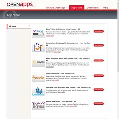
In the beta release, there is a fairly small set of apps – Bing and Yahoo search, comparison shopping with Shopping.com, news/topic search with Daylife.com, Oodle Classifieds, and Twitter user/topic searches – but they list a number of other potential apps such as zip/postal code lookups. The best way to understand it, however, is to try it out. I did this in about 3 minutes (although, to be fair, I had seen Krispy demo this last night).

First, go to OpenApps and sign up for a free account, which requires only your email address and a password:

OpenApps home screen

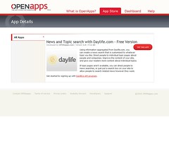
Next, go to the App Store to see the list of available apps; you can click on one to see more details about it, such as the Daylife app for adding news and other relevant content based on keywords:

OpenApps app store OpenApp app details for DayLife

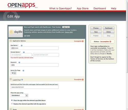
Click on “Try this app” to fill in the parameters for adding this app to your site. Shown below, I changed the “App Name” field to “BPM news”, specified the keyword “BPM” and – this is the magic part – told it to adopt the look and feel of www.column2.com:

OpenApps configuring DayLife for Column 2

I clicked on “Preview”, and this is what was generated:

OpenApps DayLife page preview on Column 2

Click through for the full-size image, and you’ll see that OpenApps has replicated the look and feel of Column 2 (which is built on WordPress), including my header, sidebar and styles, and inserted the Daylife page based on the BPM keyword into the content portion of the page. Very, very cool.

To be able to publish this, I filled out the subdomain section of the application parameters, and changed my DNS to create a CNAME record “news” to point that subdomain to OpenApps, but they even provide links to step-by-step instructions from some of the popular domain registrars on how to do this. That took me another minute. I also had to sign up for a Daylife API key so that I could publish their content. There went another minute. That produced a page, news.column2.com, publishing Daylife content based on the BPM keyword, that appears to be part of my site, all done in about 5 minutes (plus wait time for DNS propagation and Daylife API account approval).

The page, of course, isn’t really on my site. The DNS change means that that URL redirects to OpenApps for the presentation, with the app content section redirected to Daylife. Still, it’s all pretty seamless. The magic part of OpenApps, where they make it look like my existing site, has to do with their technology to auto-locate the injection point for content for a number of common web content management systems, including WordPress, Joomla, Typepad, Movable Type, Drupal and Blogger; there are also methods to use a more complex manual detection process based on the page elements if you’re not using one of those platforms, or are using them in a non-standard way.

OpenApps is free to use; Krispy told us that developers who create apps for their app store retain 70% of the revenue, meaning that OpenApps is monetizing on the 30% commission that they charge to the app developers.

Pimping Your Fish at DemoCamp Toronto 25

After we heard from Gurbaksh Chahal, the rest of DemoCamp proceeded as usual. We were in the Ted Rogers School of Management, part of Ryerson University, in a really great lecture hall space that seats a few hundred people; it seemed like most of the seats were filled that night.

First up was Albert Lai of Kontagent. Albert demoed at the first DemoCamp and has appeared at at least one other. He seems to get a bit of a pass from the organizers: this time, as with the last time that I saw him, he had no actual demo – which is typically a requirement – but a lot of slides talking about social games.

After that, it was mostly Facebook night at DemoCamp: four of the five demos that followed were Facebook applications.

Next up was Mark Zohar of Scenecaster, showing the My 3D Cards application on Facebook. It uses the 3D foundation that they’ve built for enterprise projects, and used it to to take Facebook content and other rich content (video, photos, external links) to create a 3D rich media greeting card, displayed in a 3D application running in the browser using a custom Flash viewer. The idea was to show an immersive, engaging presentation of content for a specific purpose. The second app that he showed was Causes, which creates 3D content posted to your Facebook wall related to charitable causes. For causes such as Red Cross and WWF, it shows an “I donated” card with your picture, links to video about the cause, and a link to the donation site. They’re also working on an app for virtual gifts, using animated 3D, supporting multimedia and user-triggered animation; in the future, they’ll be looking at branded virtual gifts, too. In addition to their own apps, they’re syndicating their apps to other developers for other vertical applications; the first of these being developed is a 3D yearbook. These will be premium offerings, directly monetized within Facebook. They have a team of 5-6 dedicated people, using AWS, EC2 and S3 cloud-based content, composited at the client.

The demo that gave me this post’s title was by Greg Thomson of Tall Tree Games, showing their Fish World Facebook app: you can buy, raise and feed fish in a tank. (The friend I was there with turned to me and said “hey, my son plays with that!”) The focus of the demo was on monetization, a key subject for Facebook app developers: in this case, tanks are monetized through a variety of purchases, including fish, themes (including seasonal and holiday themes), plants, music and food. It uses two currencies: Facebook internal “coins” and fishbucks, which are actual purchased currency, at 5 fishbucks per $1. They find that they need to release new content a couple of times per week in order to maximize consumption; this is often done by creating a need (e.g., tank gathers algae, friends can steal fish), then selling a solution (e.g., algae-eater, security fish). They’re using analytics for targeting specific audiences, and in spite of my friend’s comment about how her son (who is under 10) plays with this, Thomson said that their primary demographic (75%) is women 20-35 years old. Huh?

Greg Balajewicz of Realm of Empires was up next, showing their massively multiplayer online strategy game on Facebook: you start with a village, build it up, recruit troops and so on. Everyone in the game is an actual person, with the game ongoing 24×7, and you can collaborate with others to plan battles and other campaigns. They have about 80k monthly active people in the game, 20k active daily, and although the game is free, they monetize with premium features that save you time in the game (e.g., a larger map view), but don’t explicitly advance your position in the game. They also have a standalone app, currently not monetized although they might offer a premium feature like this within the game, that allows any player to get a world view of all villages. They’ve done this with a small team and the three founders, with most people working remotely from each other and communicating using Skype. The game is targeted at men aged 25+; it can be played effectively in as little as 15 minutes per day. About 60% of their current players are in the US, 30% in other western countries, and a significant southeast Asia population at 7%.

Oz Solomon of Social Gaming Studios showed us their two seasonal apps: My Year in Status, and My Year in Photos. My Year in Status allows you to capture your year through your status: select a style, add a caption, and it generates a (text) collage of your status updates from 2009; you can customize and publish it to your news feed. My Year in Photos picks 16 photos from your 2009  photos (you can choose others if desired), then generates a photo collage for your news feed and photo album. Unlike the other apps, which are looking for steadier, constant growth, the seasonal apps had to spring into action for only a short period over the year end. They had 11M people use the app in a three-week period, with over 45 collages generated every second; it was the 3rd fastest-growing Facebook app for the week of Dec 21st after being covered by the mainstream media. About 80% of the users are women. They started work on the app on November 13th, launched it four weeks later, then had to do three server upgrades in a week to keep it up and running: they are using their own dedicated servers rather than cloud infrastructure. They found that seasonal apps are good for capturing viral streaks, but it’s best to build them on frameworks and code that you’ve developed for stable apps (such as their existing Status Shuffle app) in order to allow for fast development. Also, you can typically reuse these apps the following year, with some minimal-cost tweaking to keep them fresh. One interesting thing that he pointed out is that for the My Year in Status app, they fixed their #1 complaint, which was the lack of ability to choose which statuses were used, and found that although it reduced complaints by 80%, it only increased conversion rates by 2%: keep in mind that your most vocal detractors may not be that important to your bottom line.

Last up was Roy Pereira of ShinyAds.com, with the only non-Facebook app of the night. ShinyAds is a self-service advertising platform for web publishers that passes through more of the ad revenue to the publisher than other ad platforms such as Google AdSense. It’s not an ad network, but a tool for the web publishers to interact directly with advertisers. Advertisers can create their own advertising banner using a wizard-like interface: add or create a banner image, set the ad budget, set the click-through destination URL, set start and end dates, and target by geography. Once the ad is approved by the publisher, it’s inserted into the publisher’s ad server, or can use the ShinyAds ad server. Payments are made automatically to the publisher based on actual metrics, with the publisher interface includes a view of metrics and analytics.

All in all, a great DemoCamp, and the venue was excellent. I had stopped attending after a few disastrous nights in too-small venues (usually pubs) with crappy AV and wifi, but this has me back as a convert.

Gurbaksh Chahal at DemoCamp 25

DemoCamp Toronto #25 was held last week, with the usual array of demos and an extra special keynote: Gurbaksh Chahal, the highly-successful serial entrepreneur currently engaged in GWallet, an online payment system. Previously, he sold his first company at the age of 18 for $40M, then built BlueLithium to a point where it was acquired by Yahoo for $300M, and there were a lot of eager people in the audience to hear how they could get replicate that sort of success. Some of them were carrying along copies of his book, The Dream, hoping for an autograph.

He had a great set of points that I tried to capture; with each of these, he included examples from his own life that made them relevant:

  • The idea is only 1%, the rest is execution.
  • Don’t get too attached to your ideas. Sometimes that idea that you start a company with is just a starter idea, it’s not the one that you want to take to completion.
  • The biggest ($) deals happen when a company is bought rather than sold; that is, the buyer seeks out the relatively scarce resource and offers based on the perceived value of that scarcity, rather than the seller putting themselves up for sale.
  • Hire only rock stars, pay them well, and let them share in the ultimate rewards. Expect long hours, hard work and brilliance from them.
  • Never leave yourself vulnerable; consider everyone replaceable.
  • Don’t expect charity or favors, especially your first time around.
  • Never raise money when you need it: get traction first and wait for the money to come to you.
  • Bring in venture capital even if you have the means to self-fund, since that brings other ideas and governance.
  • In budgeting and spending, understand the difference between need and necessity. Money is finite, spend like every dollar is your last. People will only be impressed by your performance, don’t worry about the fancy trappings.
  • Every entrepreneur needs confidence (or the appearance of it). In any meeting, focus the conversation on the purpose of that moment.
  • Relationships are everything in life and the business world. Never burn a bridge. They’re not buying a product, they’re buying you.
  • There are only 5 key decisions that you need to make in order to make or break your company – make them wisely. His example at BlueLithium: hiring dream team, acquiring AdRevolver, raising 11.5M, opening up Europe a year after the US, selling to Yahoo at the right time for 300M although board didn’t want to sell. Knowing which are the key decisions requires instinct.
  • Surround yourself with people who want to see you successful and who are hungry. You don’t want to reward people who don’t contribute: you need people who will take a risk with you, and get rewarded for it.
  • Embrace rejection. Everything happens for a reason, it makes you stronger.
  • Make decisions, even if they may be wrong.
  • Always negotiate from a position of strength. Perception is reality: show people what they want to see, and tell them what they want to hear. Believe in yourself and sell the dream: no product or sales pitch is perfect.
  • Grow a thick skin. People will question your ability to succeed.
  • Do the work. Keep your eye on the tiger. Fight like Hell, defy the odds. It’s worth it. Never compromise your morals.

The gate receipts from that night’s DemoCamp, usually put towards some food or drink for the attendees, were donated to support efforts in Haiti following the earthquake. All of us put in $2,580; Gurbaksh, who had promised to match that, ended up tossing in another $10,000.